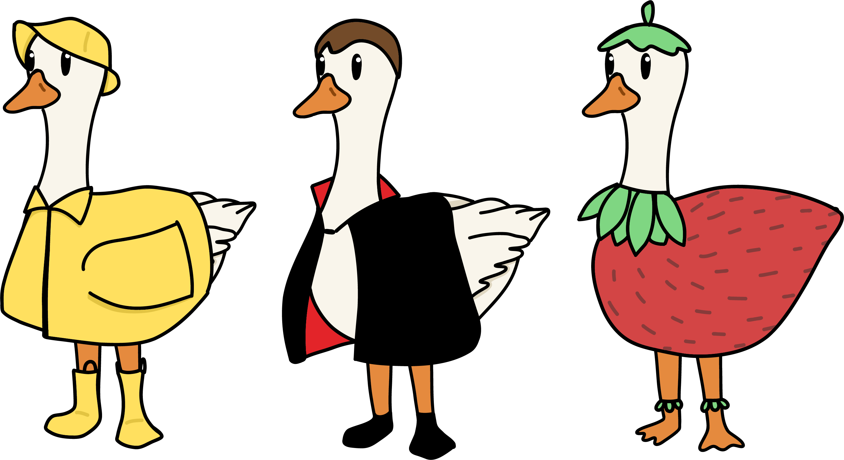
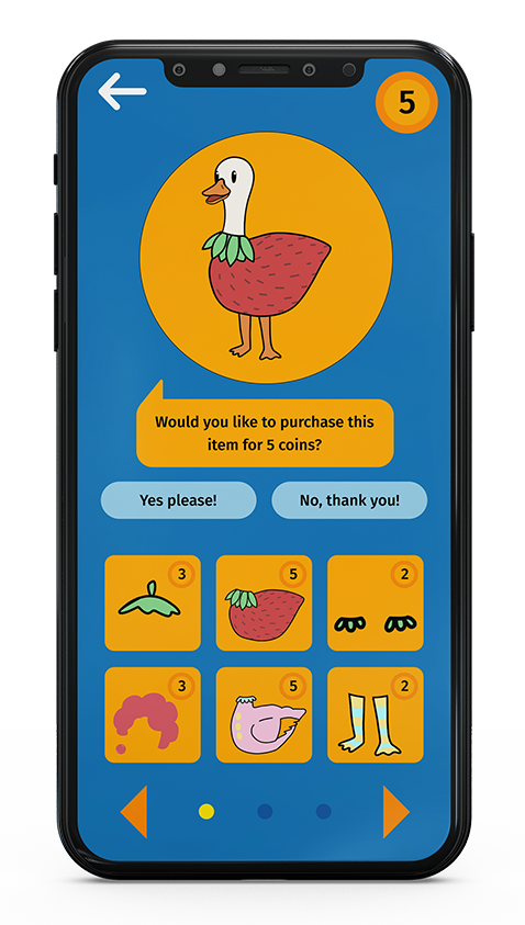
This was a group assignment where we came up with ideas for an app that'd create positive habits, and then each worked on a specific job to make said app. I was in charge of branding, app icon, and the design of the mascot. The app is called "Honk!" named after its mascot. It's a children's screen time limiting app that the child and parent would download where the parent can set the limits from their device, and the kid can use their app to ask for more time and customize Honk the Goose. I chose the blue and orange colour pallet to represent a goose in water, with the parents app having less saturated and more professional colours and the kids app having brighter and more fun versions of the same colours. The primary typeface, Fira Sans, was chosen because it's loud and bold, like a honk from a goose.